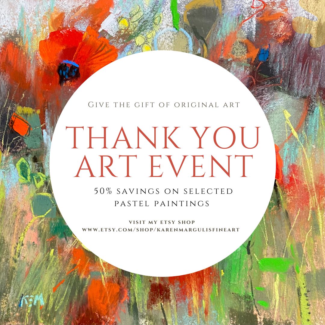
Monday, May 20, 2013

Elizabeth Mowry Workshop Report Day 1


'Looking Inward'. 9x12. Pastel

I am so glad I decided to take this workshop with Elizabeth Mowry. What a wonderful artist and gentle spirit she is. As she spoke so eloquently about her love of nature I felt a special kinship. When I talked to the group about the painting I did during the sharing time, I spoke about how I like to look inland at fields and meadows for inspiration. Elizabeth understood this! I know I will come away from this workshop inspired and enriched.

The workshop began with Elizabeth doing a 2 hour demo. She feels it is important to show how she resolves a demo painting and not just how she starts. I found her demo very interesting and very different from how I usually work. She uses wallis paper and Girault pastels. She goes right in with local colors and works from the sky down. When she saw how I was starting my painting she said "oh you are one of those color people" I smiled. Yes I guess I do love color!

After lunch we painted for 2 hours then had a chance for sharing and feedback. The day ended with Elizabeth's slide presentation of her journey as an artist. I enjoyed hearing about her life and work! I can't wait to go back tomorrow.

I learned an interesting use for pastel pencils and I will share this with you when I can do a more complete post.


Sunday, May 19, 2013

Studio Tip: A Great Use for Pill Containers


'My Dream Garden'            5x7        pastel        ©Karen Margulis
I love boxes, bags and containers.  I am always looking at them trying to find ways to use them for my art.  The other day I was on a thrift store binge and came across the cutest little pill case. It was bright orange faux croc and had a plastic pill carrier that fit inside. It even zipped close!  Best of all it was only 77 cents.  I had to have it even though I didn't need it for pills.

I kept on shopping.  A few aisles later it came to me.....I could make it into a travel watercolor set!!!  It was the perfect size. I went home and filled the 8 wells with tube watercolor paint. I put in my favorite colors of Daniel Smith and Schminke watercolors. It took a few days for the paint to dry but now all I need to do is wet the wells when I am ready to paint. I am thrilled with my little set.  

I even picked up a small black pouch that will fit the paints, a few brushes, a spritz bottle and colapsable cup for a truly portable watercolor set! 


I don't do watercolor paintings but I often use them for underpaintings for my pastels as I did in today's painting.

Monday I am attending a 3 day workshop with Elizabeth Mowry. I will do my best to post and I am hoping to review my time at the workshop so stand by!

Saturday, May 18, 2013

A Great Idea for Wedding Favors...Mini Paintings

'Kiawah Gold'      2x2  acrylic on canvas

I love commissions.  I enjoy working with art lovers to create the perfect painting.  I have many stories of fun and interesting commissions.  It would actually make a fun book with the paintings and their stories. The paintings often push me out of my comfort zone but it is always fun trying to paint what my client is imagining.  Of course the best commissions are the ones where I am given free reign to paint with a minimum of guidelines....like these mini acrylics.

The Collection of Kiawah Paintings
I was asked if I could paint six 2x2 inch paintings of Kiawah Island to be used as wedding favors. What a great idea!  I offered the bride to be a choice of mini pastels which would need to be framed or acrylic on canvas which could be placed on mini wooden easels. She chose the acrylics and shared a few of the Lowcountry marsh paintings of mine that she liked.

I used Interactive Acrylic paints which are slower to dry than regular acrylics (though I found that the Golden Open acrylics stayed wet much longer. In fact they took a couple of days to dry!)  I used a small brush and a tiny palette knife.  They were a lot of fun to paint and I hope I get more of these commissions!

Interested in trying some of these mins? Here are some tips:

  • Keep it simple. I used a limited palette of alizarin crimson, ultramarine blue, cad yellow medium and white.
  • For reference material I used photos of my previously finished paintings on my ipad. This way I had already worked out colors and composition.
  • I worked on all 6 at the same time. I began by blocking in the darks with a thin mix of the alizarin and ultramarine
  • I then worked on each one individually until it was finished. I started with a thin layer of color and finished with some thicker paint applied with a palette knife. 
  • I wrapped the paintings around the edges. Another option would be to paint the edges black or a dark color. 

'Kiawah Summer'    2x2   acrylic

'Kiawah Twilight'      2x2     acrylic

'Kiawah Marsh'    2x2     acrylic


'Kiawah Dawn'      2x2     acrylic

'Kiawah Dreams'       2x2      acrylic

Thursday, May 16, 2013

Painting Inside the Box

'Our Friends Across the Creek'           8x8           pastel      ©Karen Margulis
available through Daily Paintworks auction

Creative people think outside the box. Always seeing things in a different way. When I paint I am always trying to find my own unique and personal way to interpret my subject.  But it is often too easy to fall back on what is comfortable.....using our favorite papers, painting with the same 'go to' colors, using the same formats for every painting.

Why not change it up this weekend. Start by painting Inside the box.....that is try painting in a square format!  If you haven't tried it it will be a fun challenge. There is something about the tension in a square that makes composition interesting.  I came across a great blog post on composition from the Will Kemp Art School. Here is a quote about square formats:

The square format: This can work extremely well or very badly. You very rarely see a square old master painting. This is because it is harder to balance a painting that has lots of elements within, for example, a collection of figures in a landscape within a square format. It can look awkward very easily. However, using a square format for a more contemporary subject, an abstract or a minimalist seascape, can be very effective.

'My Sanctuary'   6x6  acrylic on panel   $55 Etsy

'Blue Magic'  4x4   acrylic on panel  $35

'Marsh Colors'    4x4    acrylic on panel $35

Tuesday, May 14, 2013

Painting a Sunset....When Photos Lie

'Canyon Country Magic'          11x14          pastel
click here to purchase $145
 I am a sunset chaser.  When I travel I find out the sunset times so that I can arrange dinner around sunset and the surrounding magic hours.  Before I painted I took photos. I had the whole 35 mm set up with filters and several lenses. I even shot slides. I learned how to take sunset photos that were properly exposed (not always successful)  So I tend to be extra critical of my point and shoot sunset photos. They don't always make good references for painting. Take the example below:


My point and shoot reference photo
Unless you can adjust the settings most point and shoot cameras on auto don't do a good job at capturing the sunset. It is hard to get the proper exposure for the bright intense sky and the dark ground. Either the ground is properly exposed and the sky is too light and 'pastelly' Is that a word?  Or the sky is exposed for the bright intense colors in the sky and the ground is too dark. In fact the ground is often so dark it can print black.

If you paint from one of these reference photos and you don't pay attention to how the photo lies...then your painting will be missing the truth.  Take an underexposed foreground for example.  If you were standing there in real life in front of the sunset you would realize that you would be able to see lighter and more color in the foreground. It won't look black to your eyes.

Avoid Painting the ground Black in a Sunset Painting!

closeup of my foreground showing the colors I've used
The colors in a dark 'sunset' foreground will tend to be dull colors.  I don't use much brown in a painting but this is a perfect time to use those dull colors....dark yellows, dull greens, grayed purples, rusty reds, dark blues and burgundy. These are some of my go to colors for a dark foreground.  It is much more interesting than using black silhouetted shapes.

Monday, May 13, 2013

Fast and Loose...Ideas for Painting Fresh Flowers


'Grandmother's Garden'          8x10        pastel        ©Karen Margulis
click here to purchase $145
 I like my flowers fast and loose.  I don't have the patience to paint every petal. So my flowers tend to be more of an impression of the flower and not photo realistic.  I certainly admire artists who are able to paint flowers and have them look lifelike but I know that it is not a style that fits me. So I embrace what comes natural to me and try to improve it with every painting.

Flowers are the perfect subject to practice being loose and painterly. They can be quite complicated with all of the petals and tangle of foliage. It is all too easy to get caught up with all of this detail and end up with muddy overworked flowers.  Here are some of the things I try to keep my flowers fresh:


  • Start with a wet underpainting.  I love doing a drippy watercolor underpainting for a flower pastel. Because it is a bit uncontrolled and unpredictable it forces me to react to this underpainting rather than getting too fussy and dissecting my reference photo.  In a wet underpainting the flowers and foliage are already impressions or suggestions....it is my job to refine them a little. My goal is to leave as much as the underpainting showing as possible....I will often use only one thin layer of pastel over the underpainting. In this painting I glazed a light blue over the green background and left it alone.


  • Count your strokes.  See how few strokes it takes to paint a blossom. A great exercise to try is to paint small single flowers and count the strokes. See how few it takes to suggest the flower. Don't try to make a painting...just practice!  
  • For the Hollyhocks I started with the darkest color I saw in the bloom and I added three or four more colors on top of the dark.I used the side of my pastel to make fat juicy marks. 
  • Put a stroke down and try to leave it alone. Muddy looking flowers often come from too many layers and too much fussing. Again....do some practice flowers!

Sunday, May 12, 2013

Finding A Painting Subject that Speaks to You


'Desert Color'        4x4      oil on panel      ©Karen Margulis
click here to purchase $50


What is your most favorite subject to paint?  I have always found it hard to decide. So many things interest me. I don't believe we have to choose only one subject. Why not experiment and paint what you are drawn to? You will figure out if it is a good fit.  The more you paint, the more you will understand what speaks to you. You will know!

For some artists, it isn't about the subject matter at all....it might be about the light or the shapes or line quality that excites them to want to paint a certain thing.  In yesterday's post I talked about finding our Visual Voice. I shared when I discovered the subject that really spoke to me and that was Queen Anne's Lace.  But as I reflect on this discovery and try to understand what it means I realize that it isn't just Queen Anne's Lace that I want to paint with passion.

For me it is about finding the beauty and the interesting in the most unexpected places.  Those places that are often overlooked. They are the places and things I want to paint.  My husband calls them my weed paintings. Many people overlook the patches of wildflowers that grow along the roads and in parking lots. But to me they are just calling out to be painted.

'A Splash of Red'     5x7    pastel   Bid here
'Sego Lily Blooms'      5x7      pastel    Bid here
I find I am drawn to these overlooked and passed over places. I always manage to find something intriguing.  Take the desert....another one of my favorite places.  When I tell people I love the desert, not everyone gets it. "It's just all dry and brown" they tell me.  But I know better. The desert is filled with subtle beauty such as these cactus blooms. As Renoir said,

"There isn't a person, landscape or subject that doesn't poses at least some interest - although sometimes more or less hidden.   When a painter discovers this hidden treasure, other people immediately exclaim at it's beauty"  Pierre Auguste Renoir

If you need help in figuring out your visual voice I recommend the book 'Finding Your Visual Voice' by Dakota Mitchell.


Saturday, May 11, 2013

Finding Your Painting Voice

'Beautiful Blooms'           9x12      acrylic and ink on canvas         ©Karen Margulis
sold

I remember the day I discovered my visual voice. I had been painting a little bit of everything and trying a variety of styles. Some subjects I enjoyed. Some styles were comfortable. But others were just not a good fit.  At the time it worked for me to experiment. I was learning about my medium and what I could do with it.  But I didn't feel like I had my own voice.

Then one day I painted some Queen Anne's Lace and everything clicked. I had found a subject that I was passionate about. I got totally lost in painting them.  My true voice was emerging. Now I still do continue to experiment and play with subject matter and techniques but that is to keep things fresh and fun. I know that when I return to the subjects that most inspire me I will usually do work that is mine alone.

Have you found your own Visual Voice?  Here is a book that may help you understand what it is.

'Magical Queen Annes Lace'       16x20     pastel  $175
 The book is called 'Finding Your Visual Voice A Painter's Guide to Developing Artistic Style'  by Dakota Mitchell.  It is a hard cover spiral bound book filled with insight from other artists and questions and exercises and demos. I haven't had the chance to work through the whole book but the first chapter really grabbed my attention.

The author talks about how important it is to discover your source of inspiration....in other words where you get your inspiration from about what to paint and how to paint it. Inspiration must come from your core,  from your heart, something that comes to you intuitively.  We can be inspired by another artist and try to emulate them but if their style doesn't come naturally to us,  we may end up getting frustrated. "Do Your Own Thing" is good advice.

'Blue Sky Day     16x20   oil on canvas
Here's another  great quote from the first chapter. It is from Albert Pinkham Ryder.

"Imitation is not Inspiration, and inspiration can only give birth to a work of art"

I began my journey by trying on other artist's styles and subjects but when I finally listened to my own voice and painted what really spoke to me, I began creating work that was truly my own. So as Dakota says, Never be afraid to listen to your own artistic voice!

Now I am going through a stage where I like to take my favorite subjects and see how I can interpret it with different mediums and different ways....just another leg of my journey!

Friday, May 10, 2013

Pastel Demo ... Painting a Tangle of Wildflowers

'Field of Dreams'         11 x 14  pastel     ©Karen Margulis
purchase painting here $165
Sometimes you find beauty where you least expect it. I came across this tangle of wildflowers in the parking lot of the Moab Utah visitor's center. I wasn't expecting them. Maybe some cacti but not these wonderful prairie wildflowers. I took several photos and forgot about them.

Today I was working on some unfinished paintings. I had this underpainting but didn't have the original reference photo. I thought it would be perfect for my Moab wildflowers. Below you can follow along as I developed the painting from the underpainting of big simple shapes to the finish. I never start with the flowers and grasses.....these come after I establish the underlying structure.   Enjoy this demo and I welcome any questions at all about my process!


Thursday, May 09, 2013

Free Business Cards for Artists!


'Untamed Beauty'          9x12         pastel          ©Karen Margulis
click here to purchase $145
If you like Free stuff I've got a great deal for you.  There is a small catch. (isn't there always a catch)  You need to have a shop on Etsy. If you do then you can get 100 free Moo Mini Cards.  If you don't have an Etsy store it is well worth paying for a set of Mini Cards to promote your art.

If you haven't heard of Moo.com let me introduce you. It is a fun online company that prints great business cards. I especially love the mini cards.  They are half the size of regular business cards which make them a great conversation started when you pass them out. They are just so cute!  

What I like though is the ability to put your work on the front of the cards.  You could actually use as many of your photos as cards you want. I chose 10 paintings and got 10 cards of each design.


A few of my Moo Mini Cards with the Etsy logo

It is a very user friendly and easy process to order cards from the design and uploading of work to paying. Moo.com is great about keeping you informed about your order. And the quality is great. The cards are nice and thick and the colors are accurate. I am very pleased.

I even ordered a felt holder for my mini cards. There will be no more excuses for not having business cards handy!

My Mini Cards with the felt holder
Here's the deal about the free mini cards. Moo teamed with Etsy for this promotion. You have to pay the shipping and you will have the Etsy logo on the front your cards.  I don't mind this at all though. I will use these cards to promote the work I put in my Etsy store. Here is the link for those of you with an Etsy store Free moo mini cards link

If you don't have an Etsy shop and want to sell your work online, it is an excellent place to be. It is easy and professional and very popular. I will be posting more about Etsy soon but I invite you to visit my shop. And as readers of my blog I'd like to offer you 10% off any painting. http://www.etsy.com/shop/KarenMargulisFineArt

Wednesday, May 08, 2013

Are You in a Rectangle Rut?

'Serenity Place'          12x24       pastel      ©Karen Margulis  $250

Are you in a Rectangle Rut?  Take a look at the last few paintings you've done.  What format did you use?  Format refers to the shape and size of the painting surface. We sometimes overlook just how much our format choice effects the outcome of the painting.  Each format choice will convey a very different mood or feeling.

Many times we gravitate towards the rectangle format because it is comfortable. It relates to how we see the world...how our vision works. It is especially common for landscapes.  We can choose to make our rectangles horizontal (landscape) or vertical (portrait).  Each will give us a different feeling. I often like to take a painting that I did in a landscape format and do it again in a portrait format just to get a different point of view.


'Wide Open Spaces'       7x15     pastel   $95


'View Across the Desert'         4x12        acrylic on gallery wrapped canvas  $65

A useful exercise when planning a painting is to do thumbnails in several formats so that you can judge which format best expresses your idea. I will often do a thumbnail in landscape, portrait and square. But now I have added a new format.....the OBLONG also known as panoramic format.

The Oblong format is simple an elongated rectangle. It is a wonderful format for a landscape when you want to stress the expansiveness or openness of the scene. As Richard McKinley says in his post about Format choice "When the rectangle is elongated (1:2) beyond the standard rectangle, a sweeping panorama is created. The eye pans back and forth across the design, imparting expansiveness."


'In the Sunflower Field'         10x20      oil on canvas   $165 click here

The next time you are painting a landscape ask yourself which format will best convey the place you are painting....what mood do you want to express?  Do a few different thumbnails trying out your idea in different formats and don't forget to try out the oblong!

The only thing I don't like about this format is that it doesn't translate very well in a photo. the photos appear too small and compressed. I wish you could see them in person!

Tuesday, May 07, 2013

My Daily Studio Ritual


'Drama in the Sky'        8x10     pastel on board       ©Karen Margulis  $125 click here
A reader asked me about my daily routine in the studio. She asked how  I manage to fit in painting and blogging and teaching along with balancing time for family and household chores?  Today, Robert Genn's twice weekly letter is about studio rituals so I thought it would be a good day to share my own studio rituals.

I am fortunate that I am now a full time artist but if I intend for it to be my job then I have to be disciplined with both painting and the business part of art.  So I treat my time in the studio as if it were a job (though one that I LOVE) I am very much a homebody so long days in my studio don't bother me at all. Here is a typical day for me.

  • I'm up by 7:00 and head down to the studio with my coffee to do my online chores. I answer email, check on my Daily Painting galleries to make sure my posts were pulled overnight. I check in on my Etsy shop and see what's happening on Facebook. 
  • If I have anything to ship I package and print labels. My sister and I also have an ebay store (we are the Recycle Sisters) so I will tend to ebay shipping as well as painting sales.
  • Time for breakfast and shower. I may do laundry or household chores but usually I am anxious to get back into the studio. I spend the rest of the morning working on lesson plans, preparing for classes, organizing supplies or any other misc business things. Sometimes I start my blog post.
  • Upstairs for lunch.
  • Back down to the studio to paint. When I am teaching I usually work on paintings that represent the class topic of the week. I may work on a commission if I have any. Sometimes though I just throw out all of the discipline and paint whatever I feel like. For example last week I got the urge to try the Golden Open Acrylics. I try to respond to  Creative urges whenever I can.
  • Early afternoon it is time to write my blog post if I haven't already done so. I try to get it posted by 4:30.
  • Late afternoon into early evening I am still in the studio.  I may paint more or tend to marketing or business stuff.  My husband works late so there is never any rush to get dinner or clean up. I am never lacking for something to do in my studio!
This is a typical day. The days that I teach I try to just work around my class times. My classes drive what I work on and what I choose to paint and when I am not teaching I give myself assignments to work on.  I work errands into my day when I need to but I am happiest when I am home (or rummaging in thrift stores with my sister)

'Magic in the Air'        8x10      pastel on board   $125 click here


Next week we are working on sunsets and dramatic skies so that's what I painted today!


Monday, May 06, 2013

A Great Idea for Daily Painting Practice


'Desert Blooms'   3.5 x 3.5      pastel        ©Karen Margulis
click here to purchase $25
 What's your excuse for not painting more often?  Busy with work?  Can't focus? Not organized?  I'm sure we can agree that painting more often and practicing with our chosen medium is going to help us become better artists.  I know that it is often difficult to make the time needed for painting practice.

 I am a firm believer in trying to do something art related every day.....no matter how busy you are.  If you could paint something every day that would be the best but I know that isn't easy. If you know me then you know that when I was working full time I painted a small 5x7 pastel study everyday at my lunch time. I credit this practice time for shortening my learning curve and making me a more confident painter. I encourage all of my students to make time for daily practice. Just like learning any new skill...practice is the key...you can read and study and watch but it isn't until you DO that it will all start to make sense and notice results!

Are you ready to commit to more practice time?  I have a great idea for you.


A collection of my small 3.5 x 3.5 pastel studies
This idea requires little in terms of time or money. You only need to set aside 15-30 minutes a day. You don't need to use expensive papers.  You are going to paint 15 minute small STUDIES on pieces of matboard.  That's right...small paintings that you will consider studies. You are taking the pressure off yourself to create a 'good' painting every time you are at the easel.

 Think of these studies like playing musical scales or practicing your tennis serve.  They help exercise your painting muscles so that when you do have more time to spend on a serious painting you will have more practice under your belt.

Here is the best part..... You will be recycling materials to use for your studies!

  • I am using small 3.5 x 3.5 pieces of matboard cut outs that I covered with Clear Gesso. Read more about this in my post HERE. The gesso gives the matboard just enough tooth for pastels.
  • You can easily find inexpensive pieces of mat board at local art and hobby stores. 
  • You can sometimes get matboard pieces from frame shops or framers. Ask around!
  • Clear gesso dries clear so you can use it on colored mat board too.
  • I like the matboard for it's thickness. It makes the small size seem more substantial somehow. But you could certainly cut up your scraps of pastel papers to use for your daily studies.
'Backroads Taos'    3.5 x 3.5    $25 click here

'Moab Winter'    3.5 x 3.5    $25 click here

'On the Way to Ghost Ranch'       3.5 x 3.5    $25  click here

A few more tips:
  • Set up a small box of pastels that you can leave out and ready to use. For a small piece of matboard you don't even need an easel. Tape it to a small piece of mat board and sit at a table. Spread an old dish towel to collect the dust.
  • Prepare your papers in advance. Have a stack of paper and reference photos ready to use. Don't waste your 15 minutes looking for supplies!
  • Set a timer. If you tend to loose track of time or over work a painting....time your sessions so that you make sure you are doing small quick studies!
  • Have fun and paint what you love!